Paws for Pals
Case Study
Paws for Pals is a website application for an animal shelter that provides resources such as animal adoption, fostering, and volunteering.
Connecting a Bond Between People and Animals.
Animals are an important part of our lives. Most of us either have cats or dogs (or both!). Some have other animals as pets too, such as reptiles and birds. When it comes to pets, adopting one is where we begin. Local animal shelters often have websites where you can check out the services they offer along with available animals that can be adopted.
However, some websites may create pain points for some users, such as having trouble finding a contact page or navigating through the adoption application page. With pan points, there can be effective ways to make improvements to the website design for better user navigation. This is what inspired me to create a design for an animal adoption website called “Paws for Pals.
Below, you’ll see the case study for this design.
♦ Category
Web Design
♥ Role
UX Design, UI Design, Researcher, Moderator
Design Process
Understanding The User
Starting the Design
Refining the Design
Going Forward
Challenges
To provide improved digital features for users who want to adopt.
Understanding the User
The research for this project was conducted via interviews. The main premise of the research was to establish empathy based on the users’ pain points. The primary user group for the interviews were adults who were in need of furry companions. The users demonstrated their desires and needs for the utilization of an adoption website for animals.
Summary
User Pain Points
The following pain points were concluded from interviews.
☁ 1. Users have trouble in navigation of important pages such as adoption pages due to the heavy design on some websites.
☁ 2. Users are unable to find specific animals based on breed, age, size, or gender making it time-consuming to find a suitable match.
Representing Users
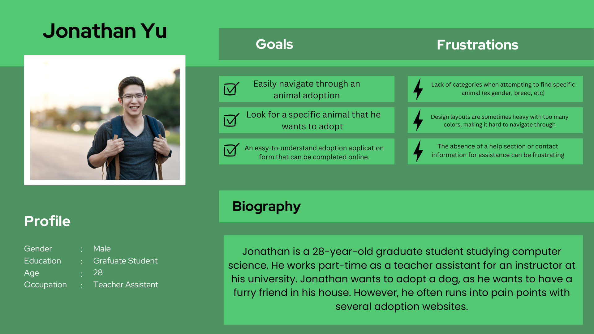
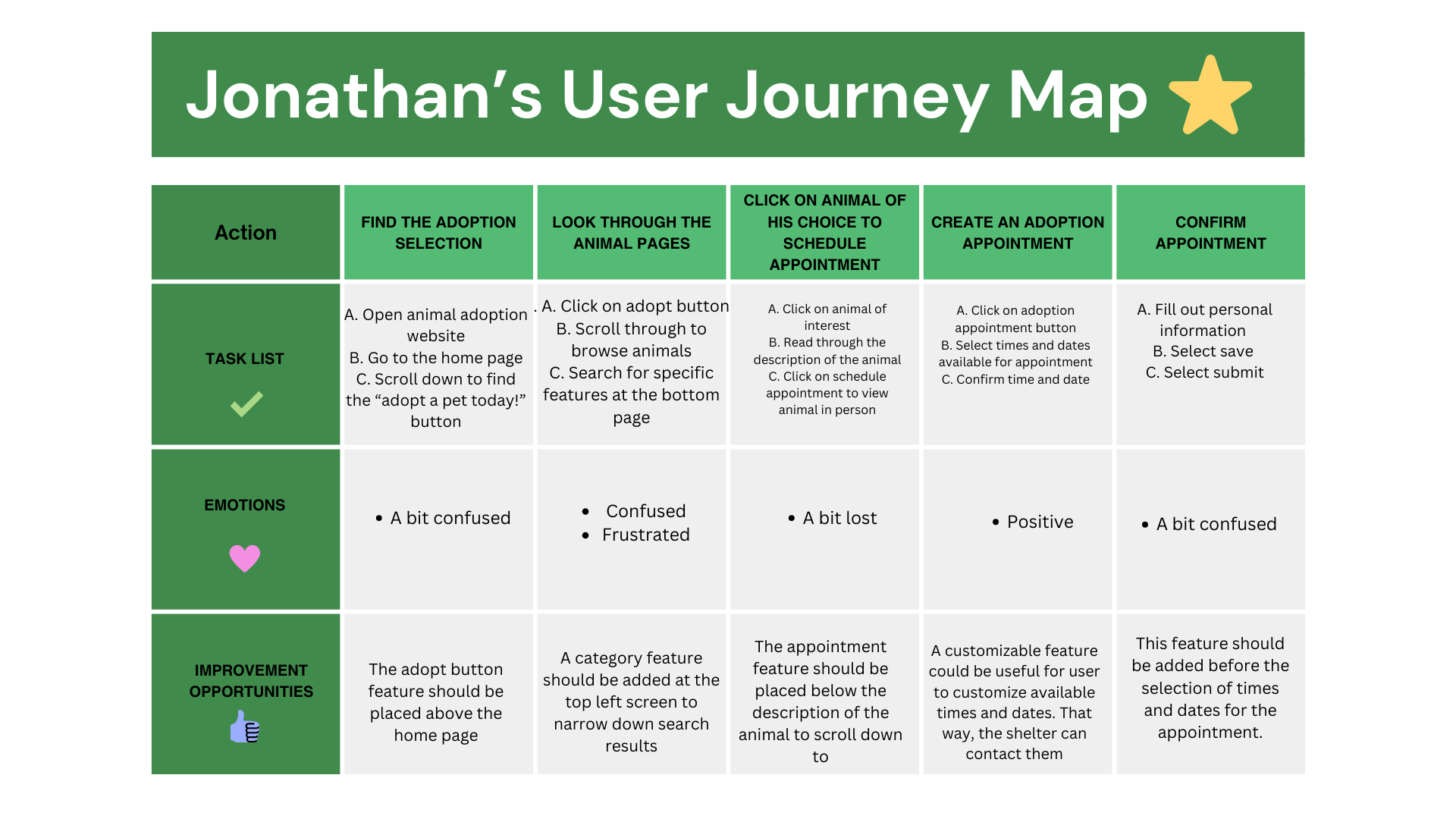
User personas and journey maps were created to further understand the user’s pain points and needs
Problem Statements
Jonathan is a graduate student who needs easy navigation to find animals to adopt on an animal adoption website application because of past difficult experiences of not finding a specific animal he is looking for.
Emily is a school teacher who needs a simple process in applying for an animal to adopt because of her past difficult experiences with lengthy and unclear instructions in animal adoption applications
Mapping out users’ journey helps to find what pain points the users might experience and what improvements can be made to reduce these pain points
2. Starting the Design
How would the application work?
To start with a rough draft, a site map was created. Here’s the original skeletal design for the flow of the website (before changes were made).
Paper Wireframes
Paper wireframes were created to envision what the application would look like.
Digital Wireframes
To digitalize the features, I created wireframes to display how the protoype would look.
A shortcut for users to find their desired animal was designed for easier navigation.
A simple menu bar was added for users to find specific features
Different screen sizes were design to demonstrate how a user might need to access the mobile version of the animal shelter website that they are trying to visit.
Screen Size Variations
Low-Fidelity Prototype
Next, I bring the prototype to life in low-fidelity.
Usability Study
Study Type
📋
Moderated Usability Study
Parameters
Location
📍
Los Angeles, CA
Participants
👥
5 Participants
Length
⏱
20-30 Minutes
Findings
A few findings were discovered during the user testing proportion of the case study
Round 1
Some users felt that the design was forcing them to navigate a certain route
Users found the navigation menu easy to use
Some found the online application form to be lengthy and time-consuming.
Round 2
Users found it complex to access the back page feature
Users reported no issue when navigating through animals to adopt sections
A few users encountered isues with loading times on some pages.
3. Refining the Design
Mockups
After the usability test, user-friendly colors were implemented along with simple font designs. This helps users easily navigate through the application.
Original Screen Size
Screen Size Variations
High-Fidelity Prototype
For the final high-fidelity prototype, the design has simple yet cooler colors to implement the user-friendly design. Furthermore, the back icons were added to address user pain points, making it easier for users to toggle between pages
Accessibility Considerations
The combinations of cool colors contribute to user accessibility. Using bright or contrasting colors make it more difficult for users with visionary inaccessibility.
2. Simple text font was utilized for users who may have difficulty with reading.
3. Back icons are more visible for users to go back to a previous page.
4. Going Forward
Takeaways
Impact
The website allows users to easily navigate through the pages and find what they are searching for. Specifically, the adoption process is emphasized in the design.
As one user stated:
“I definitely like how simple yet easy this website is! I can look through the pages without any problems!”
What I Learned
While designing this website, I learned that it is important to create a website that demonstrate equal accessibility for all.
Next Steps
Finalize the prototype and add any necessary touchups
Reach out to interested companies
Have design sent to back end developers to bring the application to life
Thank You!
Thank you for reviewing my work on Paws for Pals! If you are further interested in my work or would like to work with me, you can contact me on the link below!


